Sterling Order Manager
As the primary designer, I led the redesign of the background check consumer report experience, transforming it into a centralized hub for managing reports, workflows, and actions. Through multidisciplinary design workshops, I identified customer needs and key workflows, focusing on organization, prioritization, and streamlined decision-making.
-
Flexible viewing options: Split-screen and full-screen modes for better usability.
-
Enhanced navigation: A tab structure to support feature extensibility.
-
Persistent action bar: Keeping essential functions accessible across all tabs.
Over five years, I collaborated closely with product management to evolve Order Manager, expanding its capabilities to include Drug & Health, Identity, Adverse Action, and more.
Defining the Problem
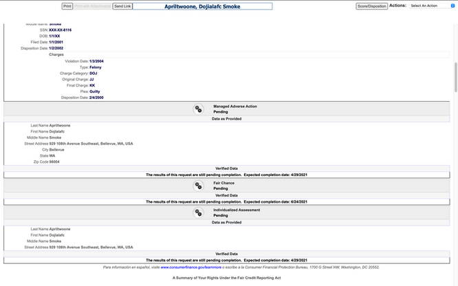
The legacy ScreeningDirect Consumer Report lacked structure and clarity, leading to user confusion and inefficiencies:
-
No clear hierarchy: Users struggled to navigate and prioritize information.
-
Inconsistent action placement: Key actions were scattered and difficult to find.
-
Inefficient workflows: Users had to switch between multiple tabs to access critical data.
-
Poor organization: The consumer report was an endless scroll, making information retrieval cumbersome.
To address these challenges, I conducted user research to identify pain points and barriers to task completion. Additionally, I gathered feature requests and future goals from the product team to ensure a scalable solution.
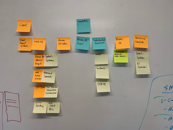
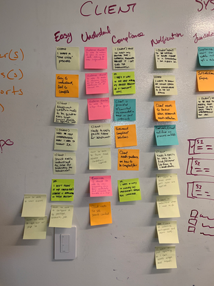
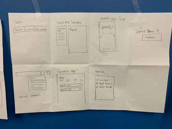
I led multidisciplinary design workshops to define key objectives. Activities included:
-
Mind mapping to visualize workflows.
-
Card sorting to improve information architecture.
-
Qualitative analysis to identify user needs.
-
Rapid prototyping to test and refine concepts quickly.
The goal was clear: Create an actionable, intuitive report to support efficient hiring decisions.
Finding the Solution
The redesigned consumer report became part of Order Manager, a multipurpose hub for managing candidates.
Key design enhancements:
-
Flexible layout options: Adaptable across mobile, split-screen, and full-screen views.
-
Split-screen drawer: Enabled users to access Order Manager from any dashboard page, filter and search data, and seamlessly switch between candidates.
-
Tabbed navigation: Organized information logically and allowed for future feature expansions.
-
Persistent action menu: Placed all relevant actions in a fixed location, improving usability across tabs.
Key Tabs
-
Overview Tab: Provided a high-level summary of candidate essentials for quick decision-making.
-
Searches Tab: Organized key report components using clearly labeled accordions, ranked by importance.
-
Additional Tabs Include Identity, Attachments, and an Audit Log for deeper insights and documentation.
The Order Manager transformed a fragmented, inefficient system into an intuitive, scalable, and action-driven platform, significantly improving user experience, time on task, and operational efficiency.


